DR MARTENS
AW/19 CAMPAIGN
The overall campaign idea is a focus on powerful moments which tell the story of the people who have put the middle finger up to a set back, battled on and got what they want. We want to create an empowering movement to encourage people to get back up and keep going. An individual worldview that gives Dr. Martens the edge over other brands and societal attitudes.
Dr. Martens have always united with disruptive people who want to do things their own way.
This campaign is the perfect articulation of rebellious self-expression.
ORIGINAL EXPLORATION
MOODBOARDS
The initial designs below are a visual language of where I wanted to take the campaign. I wanted it to feel raw and real to reflect the brands values. They stick to the brands colours of black, white and yellow. They are a sort of typographical mood board to kick start the design journey.


ART DIRECTION
Dr Martens want to own their brand colour yellow. So this was a key factor on deciding on the Art Direction. I wanted the visuals too pack a punch, and show an alternative edge. It needed to feel different, authentic, and genuine, and really stand out, while keeping with the brands ethos. So I decided everything would be handmade, and to align with the concept of the photography style there are hints of mistakes, errors and imperfections, aligning back to the creative idea, and making it feel more human. It keeps the integrity of the brand alive and keeps the visual language tactile and honest.


LOGO
STATIC & ANIMATED
Keeping the ethos of the Art Direction, I hand created the logo. I initially created the Tough As You logo by scanning the artwork 100's of times then ripping, painting, scratching, scrunching, marking with a 1460 Boot and distressing. The best variant of the logo was chosen which had the right balance of rawness, readability and personality. I then created the animated logo by scanning back in all the different art worked logo's and compiled them together to create an authentic and real animated logo, which had individuality embedded in the core,


MARKINGS
HANDMADE ELEMENTS
I wanted to create more of a visual identity which was own-able to Dr Martens. So I took their famous 1460 boot and dissected it, to create markings from the boots DNA. These are all elements which only a Dr Martens boot have. These components can then used to enhance artwork and give it a raw and textured feel, bringing another dimension to the visuals. There are a variety of different assets so that an assortment of artwork can be created with more individuality, while still feeling consistent.

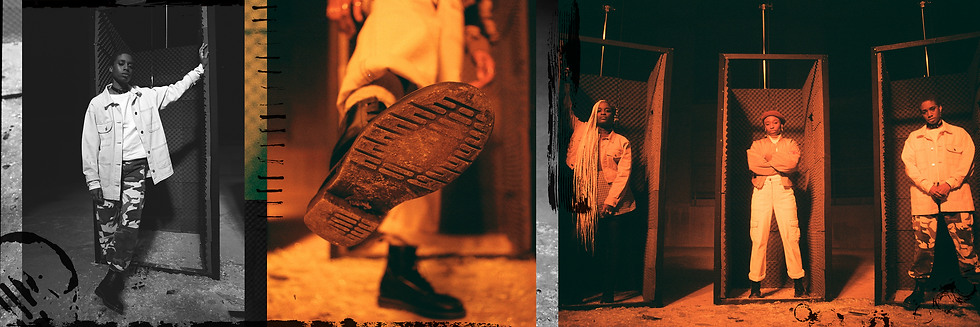
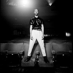
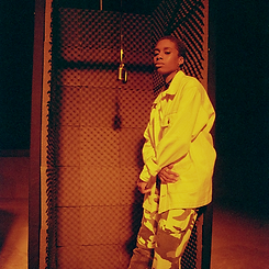
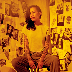
PHOTOGRAPHY
Black & white
and redscale
A technique called Redscale was used by photographer Alex De Mora. Redscale is an integral part to the campaign art direction. It ties in the brand colours while also creating a unique look own able to Dr Martens. Redscale is a process where the film is fed through the camera backwards. This felt so relatable to the creative idea of doing things your own way, and creating your own path.
We wanted to keep the campaign as authentic as possible so redscale cannot be imitated. We also used Black and White imagery as a contrast to the boldness of the redscale. The black and white tended to be the more passive of the images while the redscale had the energy.


GIFS
I created animated GIFS from the film edits, and Art Directed the movement from boot to head. This felt like a nice way to show product while keeping the focus about the person. There was a contrast between the bold movements of the black and white to the more cinemagraphs of the Redscale. The frame rate was set lower to make the GIFS feel a little more Lo-Fi and give it more of a uniqueness.


ANIMATED
TYPOGRAPHY
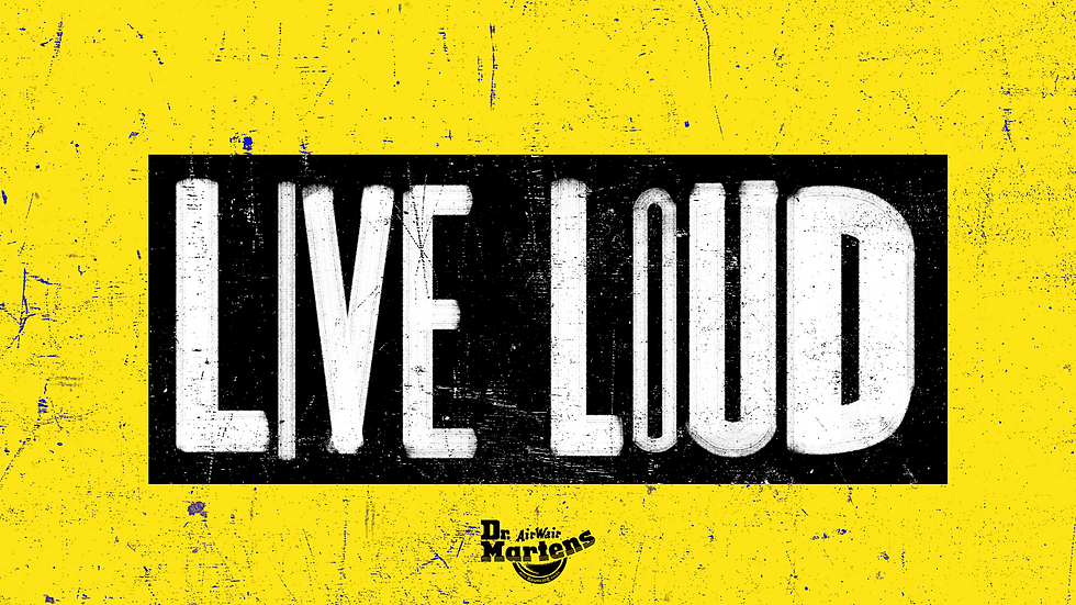
I wanted the typographic treatment used across the assets to have the same handmade feel as the rest of the campaign. The challenge was it had to be editable for other markets, so unfortunatley it could not be handmade, but I created an animated texture applied in After Effects.
This creates an effect of a constantly moving texture to match our handmade, imperfect look and feel.


TYPOGRAPHY
TITLES
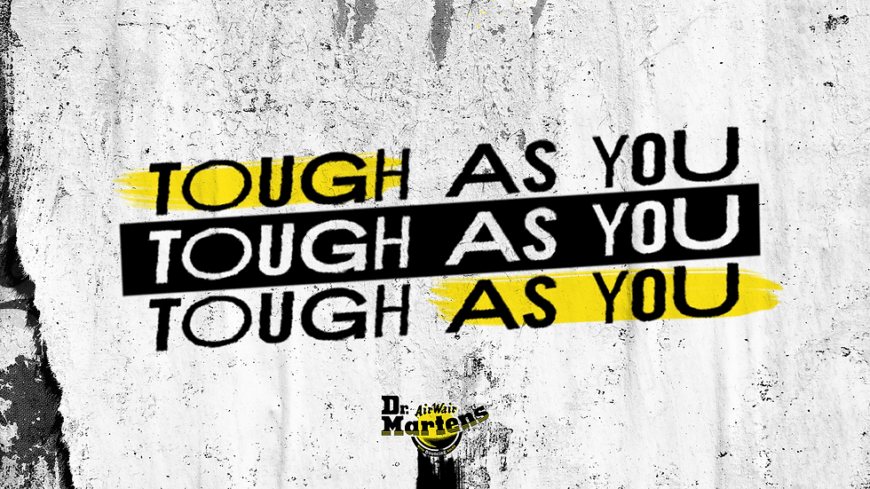
I took the same approach as above and used it for the titles on the brand and contributor films. It was simplified version for readability but has the same handmade effect.

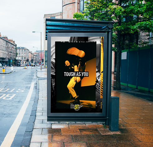
LAYOUTS
PRINT, DIGITAL & OOO
I created artwork for out of home, print and digital. There needed to be a balance of redscale and black and white, but the focus of the redscale was important as that is the unique factor. I created guidelines around how to use a grid, and how contributor photographs and background photographs are used. Each shoot has a series of background images taken to reflect the story of the contributor and these were used in the background of most of the artwork created, giving it some context to each persons story and location. It needed to be bold and stand out with the brand colours and visuals.

LAYOUTS
SOCIAL
Using the same grid as the previous assets, I created a bank of artwork which is to be used for social content. Again the balance of black and white and Redscale is important. I used the range of photographs and components to create a unique look and feel for social, which really disrupts their current feed, which is something they were keen to push.